Design
August 1, 2019
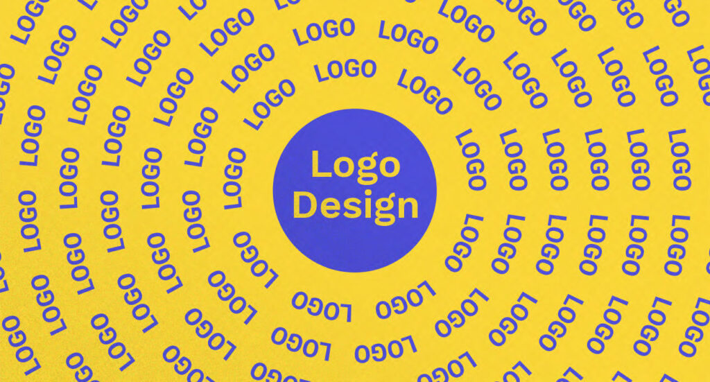
The Harsh Reality with Logo Designers Today
Any graphic designer will tell you that a logo is the first impression for any brand. It needs to look professional and aesthetically pleasing. However there is another critical component in the logo design process which is often forgotten, skipping which may as well render the entire exercise redundant.
Different types of logo designs.
I find that logo designs can be divided into two types. First category is reserved for logos that are aesthetically pleasing but unimaginative and show no signs of creativity (and with current software it’s so easy to churn them out). I personally prefer the second logo design category – logos that carry a well thought out idea or concept and can stand the test of time.
For years I have worked in design studios. I’ve outsourced work to freelance designers and managed external resources. I’ve also ran and participated in portfolio review sessions with design students. Needless to say, I have seen a lot of logo design projects. I’ve seen some very strong logo designs and some poor ones. And I’ve also seen beautifully designed logos that are weak because they lack meaning and would age very quickly.
There is one common drawback that stands out with the latter.
Enter the $5 dollar logo designer.
Let’s examine a scenario – a designer is tasked with creating a logo for a company, and is keen to impress their new client. They dive in and start exploring design ideas for a logo, often applying the current trends. However they give very little thought to the objectives of a brand and concept behind the logo.
With this type of approach, you might as well pay $5 for the logo created (tragically we know what kind of logo $5 gets you). Why? Because in a few months time, when that particular design trend passes and the logo looks aged, you will have to go through the process once again. Only to be stuck with another logo good for a few months.
If you don’t know where you are going, any road will get you there.
There are lots of online classes and tutorials out there teaching designers how to create a logo using grids, golden ratio and other design principles. These are all fantastic, useful and you may even say vital for a well balanced design. However what I always preach to design students is that a logo needs to work both from an aesthetic as well as a conceptual point of view. I even created a class about it, because I felt so passionate about the topic! You can find out more about the class ‘Creating Conceptual Work: Logo Design with Meaning‘ here.
Logo designers debate – concept vs. aesthetics.
There is a large group of designers claiming that a logo is just a logo. It should be pretty, perhaps clever – but ultimately it is just a small piece of the larger brand puzzle and doesn’t need to do much.
It’s true that a logo is only part of a brand. However a logo can often be the first and only impression for a new customer, so you need to make it count!
I like to think of a logo as an ‘Amuse-bouche’ for a brand.
For those not familiar with the term, amuse-bouche is a single bite-sized course in a restaurant, typically preceding other courses that follow, and is preselected by the chef. The function of an amuse-bouche is to offer a glimpse of the chef’s style and to set the expectation for the guests, and it has become a showcase of the artistry and style of the chef.
Imagine then receiving a bland and uninspired amuse-bouche, which would set your expectations for the rest of the meal. Or perhaps worse – getting a delicious amuse-bouche only to be tragically disappointed by the rest of the courses.
The power of a great logo design introduction.
So you can say that a logo is a single introductory bite of a brand. It has to provide an accurate introduction and convey the essence of the business, ensuring it matches the personality of the rest of the brand components and communications.
And you can only do that with a proper strategy, conceptual thinking and asking key stakeholders quality questions, rather than designing another ‘pretty’ logo with no meaning.
When a logo is a part of a larger visual system (otherwise known as a brand identity), which is based on a solid brand strategy, it can certainly take some of the pressure away from the logo. However if a logo fails to convey the essence of a brand, or sets the wrong expectations for the customer, I believe you’re missing out on a huge opportunity.
Ultimately a logo needs to strike a balance between aesthetics, simplicity, relevance and meaning, in order to last a lifetime. Otherwise be prepared to spend a lot of time and money on those $5 logos!